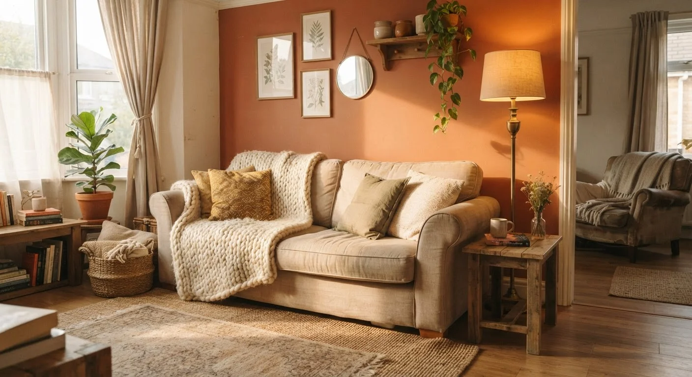
Why These Three Elements Matter More Than Furniture
Most budget decorating advice focuses on furniture - what to buy, where to find it cheap, how to upcycle it. That framing misses something important: the elements that make a room feel designed are rarely the big-ticket items. They're the atmospheric conditions around those items.
Texture, colour, and light operate at a perceptual level. They shape how a room feels before a visitor consciously registers what's in it. A sofa in a poorly lit room with no textural variation and clashing colours will look forgettable regardless of its price. The same sofa in a well-lit space with layered textures and a cohesive palette looks intentional.
This is good news for anyone decorating on a limited budget. These three variables are largely adjustable without replacing major pieces. For a broader grounding in the principles that make these elements work, see the principles behind affordable interior styling.
Texture: The Element Most People Skip
Texture is tactile and visual. It refers to the surface quality of everything in the room - smooth, rough, matte, shiny, woven, or nubby. When all surfaces share the same texture, a room reads as flat and uninspiring, even if the colours are pleasant.
Layering textures means intentionally mixing surface types. A linen throw on a leather sofa, a jute rug under a glass coffee table, or a rough-woven basket on a painted shelf - these combinations create contrast that reads as depth. The more variety in surface material, the more visually rich the space feels.
Budget-accessible texture sources include: cotton or linen cushion covers, inexpensive woven throws, low-pile or natural-fibre rugs, ceramic or clay vessels, and unframed fabric art pinned to walls. None of these require significant spending, but together they provide the layering effect that makes a room feel complete.
Mix Sources, Not Matching Sets
When adding texture, resist the urge to buy a coordinated 'set' of cushions or throws from a single display. Items from matching sets share the same surface quality and eliminate the contrast that creates depth. Instead, choose pieces in similar tones but different materials - a smooth velvet cushion next to a chunky-knit one achieves far more visual interest.
Avoid the common mistake of buying everything from the same product line - matching sets eliminate the textural variety that creates interest. Mix sources and materials deliberately.
Colour: Cohesion Over Quantity
The most common colour mistake in budget decorating isn't choosing the wrong colour - it's using too many unrelated ones. A room with six uncoordinated accent colours feels chaotic regardless of how much was spent on individual pieces.
A simple two-to-three tone palette is both easier to execute and more forgiving on a tight budget. Choose one dominant neutral (wall colour or large furniture), one secondary tone (rugs, upholstery, larger textiles), and one accent (cushions, vases, smaller objects). Everything you bring into the room should map to one of these three.
Paint remains the most cost-effective colour intervention. A single wall painted in a deeper or warmer tone - sometimes called an accent wall - can redefine the entire character of a room without requiring new furniture. If you're renting, removable peel-and-stick wallpaper panels offer a similar effect with less commitment.
For more on how colour choices interact with other decorating decisions, the guide on why cheap décor often looks cheap covers specific pitfalls to avoid.
~$30-$60
Typical cost to repaint one accent wall (DIY)
Based on average US retail pricing for a quart of interior paint, primer, and basic supplies; costs vary by region and brand.
2700K
Bulb temperature for warm, inviting light
The Lighting Research Center at Rensselaer Polytechnic Institute identifies this range as most associated with residential comfort and relaxation.
3-5 textures
Recommended surface variety per room zone
Interior design educators commonly suggest this range as a practical benchmark for achieving visual depth without sensory overload.
Light: The Variable That Changes Everything Else
Lighting is the single element most capable of undermining or elevating everything else in a room. An overhead bulb at 5000K (cool, blue-white light) will flatten textures, distort warm colours, and make a space feel clinical. Swap it for a 2700K bulb and the same room immediately feels warmer and more cohesive.
Beyond bulb temperature, consider light placement. A single overhead source casts even, flat light with few shadows. Adding a floor lamp in a corner and a table lamp near a seating area creates layers of light that introduce depth - the same way texture works on surfaces. This is called ambient, task, and accent lighting, and you don't need expensive fixtures to apply it.
Natural light management is equally important. Sheer curtains diffuse harsh midday light into a softer, more flattering glow. Positioning mirrors opposite or adjacent to windows bounces light further into a room without any electrical work. Both are low-cost interventions with reliable visual payoff.
If you're planning a more structured approach to decorating a room using these elements together, decorating a room from scratch offers a step-by-step framework. For seasonal applications of these same principles, see seasonal refresh ideas that cost less than you'd expect.
“Light is not just a utility in a room - it is a design material. How you place it and what temperature you choose determines whether your other design decisions succeed or fail.”
— Sarah Susanka, Architect and author of 'The Not So Big House'
Applying All Three Together
The real power of this trio comes from treating the three elements as a system rather than separate checklists. Changes to one affect the others: a warm-toned bulb makes your ochre accent colour richer; a rough-textured wall hanging catches that warm light and creates shadow; a cohesive neutral palette makes both pop without visual noise.
A practical sequence for a room refresh might look like this: start by evaluating your current lighting temperature and adjust bulbs; then assess whether there's enough textural variety in your soft furnishings; finally, check whether your colour distribution follows a clear hierarchy. Each step costs relatively little - bulbs, a cushion cover, a plant - but the cumulative effect reads as deliberate design.
This is also why rooms that feel unfinished often share the same diagnostic: one element is missing or out of sync. Common myths about budget styling often blame furniture quality for that unfinished feeling, when the actual culprit is flat lighting or absent texture.
For proven strategies that work across different room types, styling on a budget approaches that work across different spaces is a useful companion read.