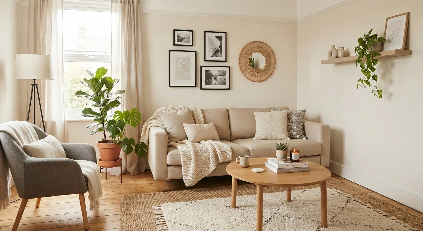
Why Principles Matter More Than Price Tags
The most common misconception about interior styling is that a better-looking room requires spending more money. In reality, most rooms that feel unfinished or visually noisy share the same problem: the underlying design principles haven't been applied. Expensive furniture arranged without attention to scale or balance will still look wrong. Inexpensive pieces arranged thoughtfully can look intentional and cohesive.
Design principles are the grammar of visual space. Just as fluent writing doesn't require expensive words, a well-styled room doesn't require costly objects. Understanding this shift - from product-led to principle-led decorating - is where budget styling begins. For a clear look at the vocabulary involved, see the Interior Design Terms Glossary for Budget Decorators, which defines terms like visual weight and accent wall in plain language.
Start With What You Already Own
Before buying anything, photograph your current room from multiple angles and look at the images critically. Photographs reveal proportion and balance problems that are easy to miss in person. Rearranging what you have using the principles of balance and scale is the most cost-effective first step available to any budget decorator.
The Core Principles Explained
Balance
Balance is the distribution of visual weight across a room. Symmetrical balance - identical or near-identical objects on either side of a focal point - feels formal and ordered. Asymmetrical balance uses different objects with similar visual weight, which feels more casual and is easier to achieve with mismatched affordable pieces. Neither approach costs more than the other; both require deliberate placement.
Scale and Proportion
Scale refers to how an object's size relates to the room and to surrounding items. A rug that's too small for a seating area, or artwork that's too small for a wall, disrupts proportion and makes the room feel accidental rather than designed. Before buying anything, measure your space and any existing pieces. Many proportion mistakes are solved by rearranging rather than purchasing.
Colour Harmony
A cohesive colour palette - typically two to three tones with one or two accents - creates unity even across varied, budget-friendly items. Warm neutrals, cool greys, or earthy tones all work; what matters is consistency. Textiles, cushions, and secondhand accessories can be sourced to fit an existing palette without significant cost.
Contrast and Visual Interest
Without contrast, a room reads as flat. Contrast can come from pairing smooth and textured surfaces, light and dark tones, or organic and geometric shapes. These pairings cost nothing to apply and prevent the visual monotony that makes minimally decorated rooms feel sparse rather than intentional.
Layering: The Technique That Ties It Together
Layering refers to building visual depth by combining elements at different heights, distances, and textures. A styled shelf, for example, might layer a tall item at the back, a medium textured object in the middle, and something small and flat in front. This principle applies to entire rooms: anchor furniture at floor level, add mid-height pieces like side tables or plants, and bring the eye upward with wall art or lighting.
Layering is particularly powerful for budget decorators because it makes individual items - even inexpensive ones - look considered. It's also the principle most often ignored, which is why rooms can feel unfinished even when they're adequately furnished. For a deeper look at why rooms stall visually, see Affordable Styling Myths That Keep Rooms Looking Unfinished.
~60%
Renters who feel limited by their decor budget
Multiple US renter surveys consistently find that the majority of renters cite budget as their primary barrier to improving their living space.
3
Colours in an effective budget palette
Interior design educators broadly recommend limiting a room's palette to two or three tones to achieve visual cohesion without specialist knowledge.
Applying Principles Without Starting From Scratch
Before any purchase, conduct a room audit: identify the focal point, note where balance feels off, and assess whether the colour palette has more than three competing tones. Often, removing two or three items resolves visual clutter more effectively than adding new ones.
Rearranging furniture to create a clear conversation area, swapping a few cushion covers to unify the palette, or shifting a piece of art to a better-proportioned wall are all zero-cost interventions grounded in these principles. Budget-conscious readers may also find it useful to revisit broader money management habits - the Budgeting Basics hub and Saving & Frugal Tips hub offer practical frameworks for deciding when it's worth spending and when it isn't.
Once the principles are clear, the next step is knowing which specific approaches reliably produce results. Styling on a Budget: Approaches That Consistently Work covers repeatable strategies recommended by design educators for a range of room types.