Why These Myths Persist - and What They Cost You
Budget decorating advice is everywhere, but a significant portion of it rests on assumptions that don't hold up under scrutiny. Many readers spend cautiously but still end up with rooms that feel unfinished - not because they lacked money, but because they followed rules that were never grounded in sound design principles to begin with.
The myths below are particularly common among renters and first-time decorators. Each one tends to either restrict useful choices unnecessarily or encourage spending in the wrong places. Understanding what's actually behind a polished, cohesive room - composition, scale, layering, light - makes it possible to get there without a large budget. For a comprehensive start-to-finish approach, this end-to-end budget decorating guide covers the full process.
Myth
Small rooms need light walls to look bigger - dark colours will make them feel like a closet.
Fact
Dark paint can make a small room feel deliberate and cozy rather than cramped, especially when paired with good lighting.
The idea that dark colours shrink rooms is overstated. What actually makes a small space feel tight is clutter, furniture that's too large for the footprint, and poor lighting - not wall colour. A deep navy or forest green, used with appropriate light sources and scaled-down furniture, can give a compact room a sense of depth and intentionality. Interior design educators frequently point out that it's contrast and light management, not colour alone, that govern how spacious a room feels. See how light and colour work together without spending big.
Myth
Everything in a room should match for it to look put-together.
Fact
Coordinated but varied pieces create visual interest; matching sets often make rooms look generic or showroom-flat.
Furniture suites and perfectly matched accessories can actually undermine a room's warmth. Design educators broadly agree that mixing materials, tones, and eras - while keeping a consistent colour story - produces spaces that feel lived-in and considered. A secondhand wooden side table paired with a simple upholstered chair often looks more intentional than two items from the same catalog page. The key is repetition of one or two colours or materials across different pieces, not uniformity.
Myth
You need one impressive statement piece to anchor a room's style.
Fact
Layering multiple modest items - throws, plants, framed prints, varied cushions - consistently creates more visual richness than a single focal purchase.
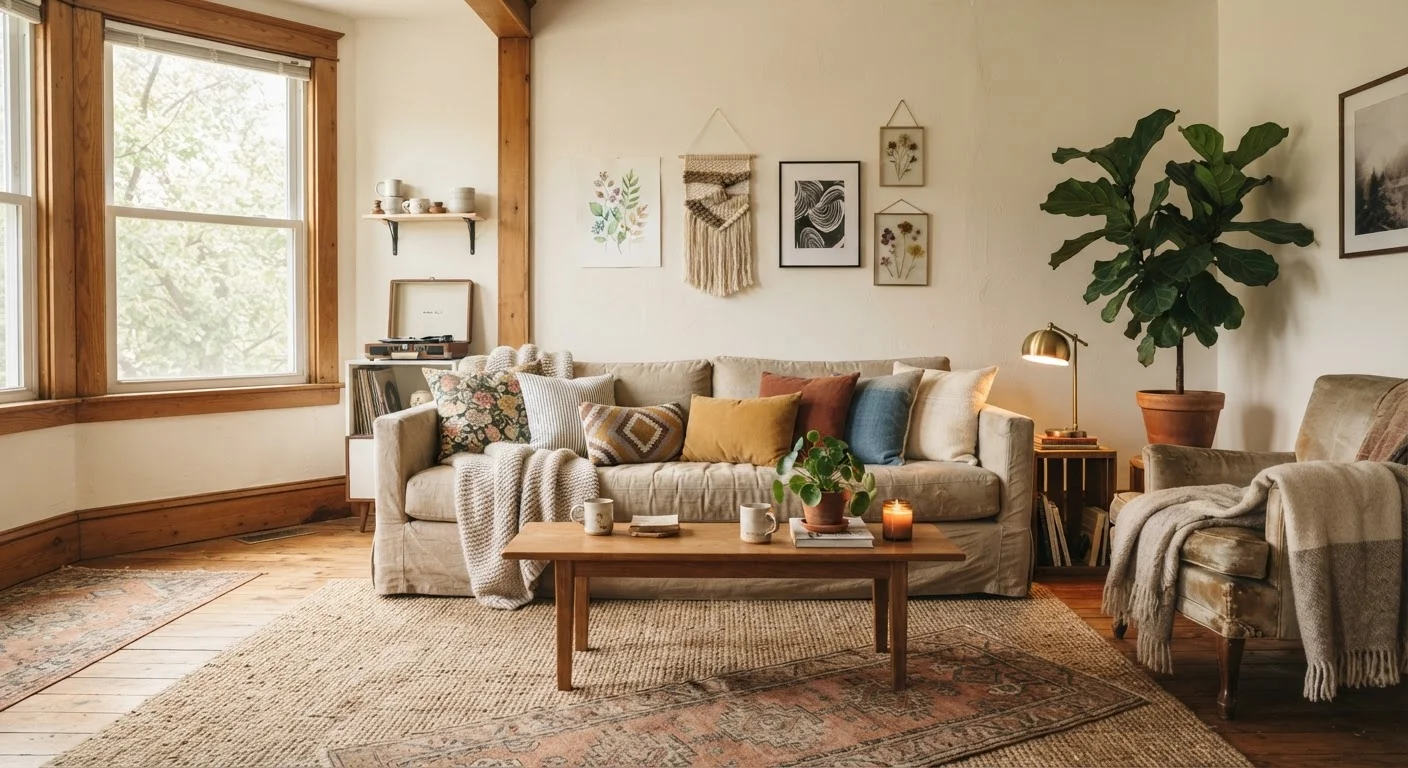
Chasing a statement piece can drain a decorating budget fast while leaving the room feeling incomplete around it. Layering is a more reliable approach: a collection of low-cost textiles, plants at different heights, and a few well-placed prints distributes visual interest across the entire space. This is also more forgiving - individual items can be swapped or updated cheaply. Avoiding the cheap look is more about deliberate layering than price tags.
Myth
Wall art has to be expensive to look good.
Fact
Scale, framing, and placement matter far more than the price of the art itself.
A large printout in a clean frame, hung at the correct height (typically eye level, around 57-60 inches to the centre), will read as intentional and polished. Conversely, a costly piece that's too small for the wall or hung too high will look awkward regardless of its price. DIY options like framed fabric, architectural prints, or even children's drawings in uniform frames can work well. For a balanced take on when DIY makes sense, see the trade-offs of DIY wall art.
Myth
Symmetrical arrangement is always the safest, most polished option.
Fact
Asymmetrical groupings using odd numbers often look more dynamic and professionally styled than strict symmetry.
Symmetry works well in formal spaces, but in most living areas and bedrooms, strict mirror-image arrangements can feel stiff. Interior styling guides frequently recommend grouping objects in threes or fives, varying heights, and distributing visual weight rather than enforcing identical balance on each side. A cluster of three candles at different heights, for example, draws the eye more effectively than two identical ones placed evenly. The goal is balance, not sameness.
What Actually Makes a Room Look Finished
Across all of the myths above, a pattern emerges: the rooms that look unfinished usually lack layering, appropriate scale, or visual cohesion - none of which require significant spending to address.
Buying Expensive Items Won't Fix Poor Composition
One of the most persistent decorating mistakes is assuming a costly purchase will pull a room together. If the underlying composition - scale, colour balance, layering - is off, expensive pieces won't fix it. Focus first on principles, then on filling gaps with affordable items that serve the room's visual logic.
A practical starting point is to audit each room before purchasing anything new. Identify what's missing in terms of texture, height variation, or colour repetition. A room-by-room checklist can help spot gaps without guesswork. Once you know what a space actually needs, you can fill those gaps strategically rather than buying whatever catches your eye.
For renters especially, it's worth knowing which changes are permitted before investing in anything permanent. Tenancy status genuinely shapes which decorating choices make sense - and working within those constraints is part of smart budget styling. For a deeper look at the principles driving all of this, the core principles of affordable interior styling explain the design logic without the jargon.